![]()
![]()
![]()
![]()
…a house is not a home until you love where you live…
How to Use Bold Colors in Interior Design
Bold colors can give your home more style and personality, breathing a new sense of life into your favorite spaces. The trick is to incorporate colors you love without going overboard and creating an over-imposing conglomeration of powerful hues. Striking this balance perfectly is less about the actual colors you use, and more about how you use them.
With this in mind, here are a few suggestions for using bold colors in interior design:
Combine Bold Colors with Neutral Backdrops
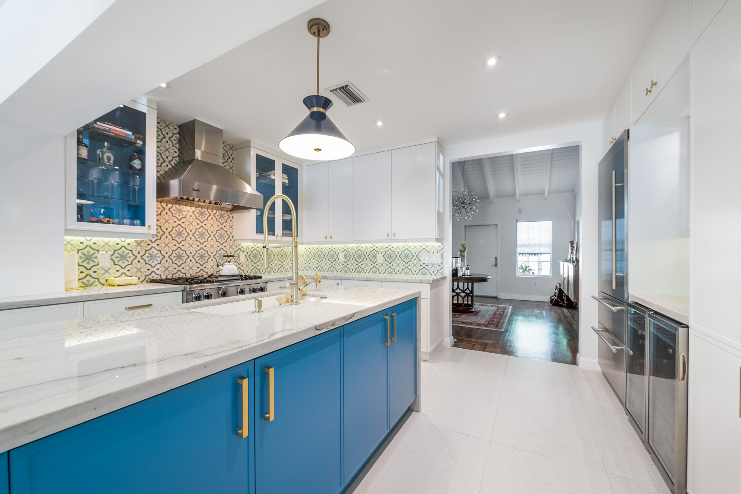
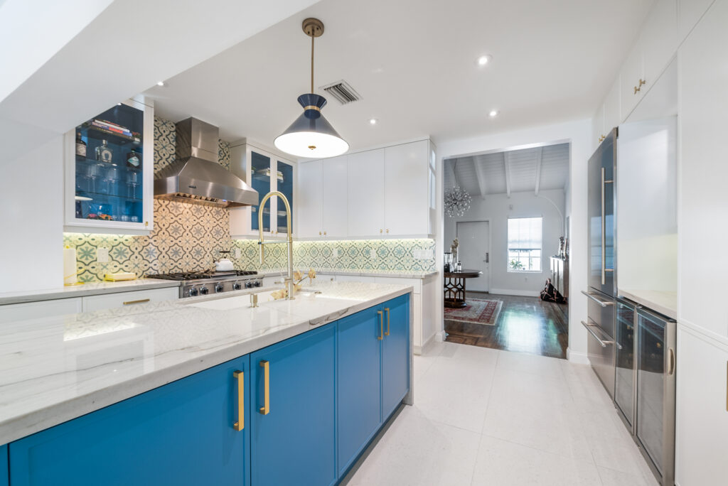
The easiest way to prevent bold colors from overwhelming a space is balancing them with calming neutral tones and warm organic textures. When you have a neutral backdrop, it can pair with almost any color.
For example, let’s say you love royal blue, and you spend a lot of time in your kitchen. So, you might consider painting your kitchen cabinets royal blue, but using colors like grey or white for the rest of the room. The cabinets are the focal point, but the lightly colored countertops, walls, and chairs maintain a calming, serene vibe.
Use Bold Colors in Small Rooms
Smaller spaces like hallways or powder rooms are perfect for experimenting with particularly bold colors. Since there’s less space, you can use a color for the walls that you wouldn’t normally use for a larger room.
For instance, you probably wouldn’t dream of painting your main living area mauve or brass, but both colors could look great within the confines of a small half bath. The color makes an impact but you’re only in the room for a few minutes, so it feels more refreshing and invigorating than overwhelming.
Experimenting with Bold Accent Colors
If you’re not ready to commit to an entire room, start small with bold accent colors. These are the colors you choose for things like pillows, ottomans, and of course, accent chairs.
When paired with a neutral backdrop, bright blues, yellows, and greens are a beautiful contrast. Much like the earlier example with the kitchen cabinets, the soft background from the walls and floors creates a warm sense of balance, so the accent colors don’t seem out of place.
Go Monochromatic
The monochromatic look – in which the walls, ceiling, trim, cabinets are all the same color – allows a bold color of your choice to really shine. At first, you might think that drenching an entire room in one color would be visually jarring, but it actually does the opposite. The smooth and cohesive palette can create a calm and relaxing vibe, which is why people tend to go monochromatic in discreet rooms where they want to feel cozy.
Feeling inspired? If you’re ready to give your home more personality and style, the team at Debowsky Design Group is here to help. Together, we’ll pick the perfect color palette for your space and build an aesthetic that truly speaks to you. Contact us today and let’s bring your vision to life.