How to Make Subway Tile More Unique

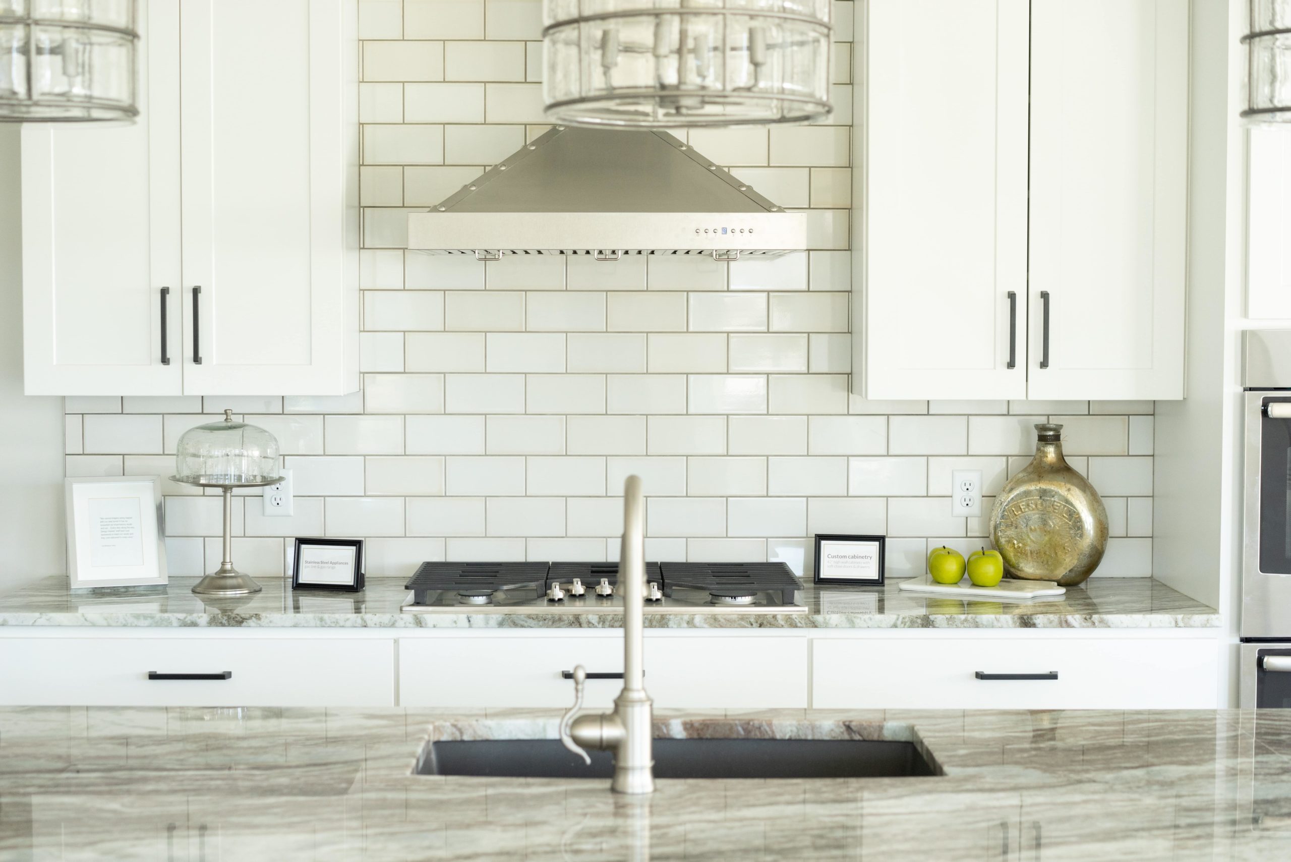
Have you been walking into your kitchen lately where you just can’t quit that feeling that it is just not speaking to you? You’ve got contemporary yet classic design elements – a big island, a triangle layout, and even a pantry fit for a king. You’ve got some fun, unique décor items, art on your walls (yes, even in the kitchen), and even great pendant lighting to go with your neutral color scheme – complete with white subway tile throughout. So, what’s the problem?
If you find that your kitchen feels bland and has a subtle unenthusiastic energy, it might be time for a tile intervention.
It’s not that the subway tile of yesteryear is entirely outdated; there are just so many additional options nowadays to spruce up your space and add warmth, depth, and dimensions to an otherwise – dare we say it – basic space. Subway tile, while a classic go-to, can also feel a bit overdone as of late. There isn’t a kitchen we don’t spy across the myriad baking shots on Insta that doesn’t have white subway tile backsplash. As of late, it feels that white subway tile can turn a powerfully designed kitchen into an unimpressive disappointment. And we all know that you don’t want that.
How to Use Patterns to Update Your Subway Tile
No shame to subway tile. It’s a classic for a reason. Traditional design elements will never go out of style. But there are a few great ways you can update subway tile to give it a fresh, modern feel. Here are our favorite pattern placements for subway tile to make a bolder statement in your home.
Basketweave – Pretty much how it sounds, this tile placement conveys a look that feels like the tiles are weaved together much like wicker would in a basket. The tile alternates between two horizontally placed tiles on top of one another next to two vertically placed tiles, and the pattern repeats throughout.
Chevron – While this pattern is well-recognized, and has had its day in the sun, it still brings a fun and playful way to utilize subway tile in your home. It is made up of rows of interlocking parallelograms that are joined at the ends for a clean zigzag pattern. Running either parallel or perpendicular, the tiles can add length or height.
Herringbone – Perhaps the most in-demand and of-the-moment layout, herringbone is popular for a reason. It’s a more updated look to the Chevron pattern and can actually be easier on the eyes. It conveys a more traditional look while also looking fresh, modern and, yes, designed-focused.
Vertical placement – This is just as it sounds. When you lay tiles out vertically, it can add height to any small space. This is especially good for smaller kitchens, bathrooms, small walkways, or even areas with big walls.
A Little Color Goes a Long Way
Additionally, one of the easiest ways to update and freshen subway tile is to look to incorporating color. There are so many beautiful colors of subway tile out there – not to mention material used to create the subway tile as well (glass, porcelain, you name it). And for those of you who are really feeling bold – color grout is making a big splash in design as well.
One of our favorite things to see these days is bold neon grout to capture a real pop of personality in a kitchen.
So, now, the only thing that remains is to ask yourself: Just how bold are you?
